Last week at the 2019 MIC, we unveiled a refreshed NISC logo and brand. And to be honest, we were a bit nervous about how it would be received.
As we continue to grow and evolve, we want our brand to match the innovative solutions we work on every day for our Members. Change can be hard, but after nearly 20 years of service and innovation under our previous logo, we knew it was time.
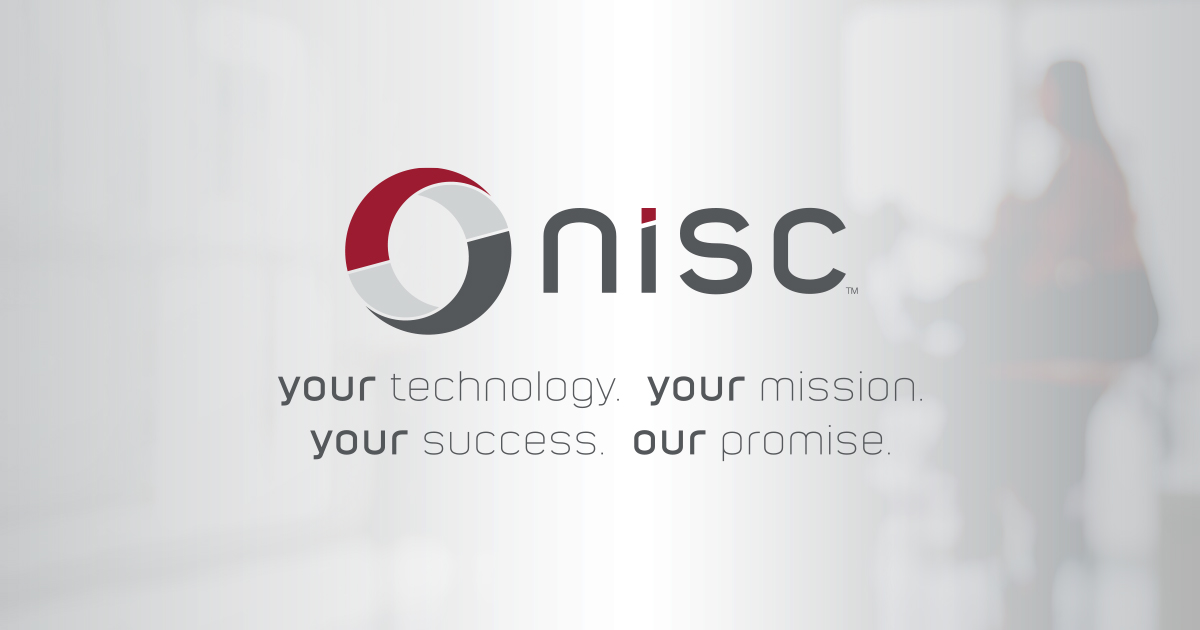
You may notice the familiar red and gray swooshes, which pay homage to our original NISC logo, while the smaller, light gray swooshes reflect the unity between our employees and our Members. The three colors that form our logo represent our Members, our employees and the relationship and partnership that binds us.
One of the best things about our new logo? It was designed by our employees – the people who know our culture best. Our designers took into consideration NISC’s history, future and valued relationships, and developed a logo to reflect those vital pieces of our organization.
We were blown away by the response at last week’s MIC. We’re so grateful that the message and meaning behind it resonated with you. We even heard that some of you loved it so much you wanted extra notebooks and stickers with our new logo!
We know change can be hard, but NISC is committed to remaining a trusted partner to our Members. We hope that as you see our new logo in advertisements, at conferences or on social media, that it provides a sense of reliability and excitement for what’s next.